There are times when you might want to visually present data directly in tables or pivot tables rather than create a chart view. For example, you may have too many values to show in a chart. Or the number of values returned by the query might vary, making the size of the chart sometimes too small to accommodate them all, sometimes too large. Or you may want to visually scroll up and down a table to compare values and would like a visual representation right there in the table.
This posting will present two ways to do that.
Here’s an example of data that we would like to represent visually.

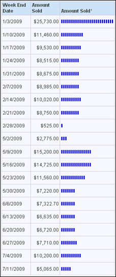
A quick and easy visualization can be done using the text Repeat function. The formula here will repeat the upper case “I” character as many times as there are thousands in the Amount Sold column.
repeat('I', case when "Sell Through Facts"."Amount Sold" is null then 0 else cast(round("Sell Through Facts"."Amount Sold"/1000,0) as integer) end )

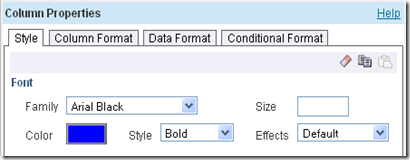
You can easily change the format of the resulting text to get the look you want. For example, here is the format that produces the visualization below.
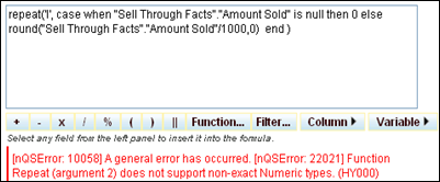
The formula casts to integer in order to avoid the following error message.
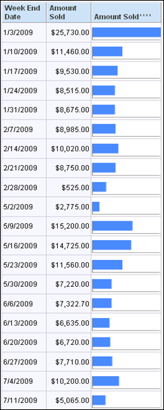
A second way to do this is to use the Google chart API to draw a horizontal bar chart. Google’s API can produce a variety of chart types including bar, horizontal bar, pie, and line. Using a line chart in the right place can be especially powerful.
The simplest way to use Google, in my opinion, is first of all to normalize the data as a percentage of the maximum value in the result set.

The second step is to create another column using a formula that will generate a URL that conforms to the parameters in the Google chart API. The first part of the formula, represented here in yellow, is text that sets chart type, size, and color. The part after that is the data. The Cast converts the normalized data to text and Replace removes any “.” characters.

Here’s the text of the formula.
'http://chart.apis.google.com/chart?cht=bhs&chs=100x20&chco=4d89f9&chd=t:'||replace( trim(cast(ifnull(100*"Sell Through Facts"."Amount Sold"/max("Sell Through Facts"."Amount Sold"),0) as char(3))),'.','')
Set the Data Format to treat text as an Image URL.

The result looks like this.
Google charts are described at http://code.google.com/apis/chart/
There you can find all the details you need to change colors, sizes, and chart types. Google’s API integrates very nicely with OBIEE. Here’s the same data, represented as vertical bar charts in a pivot table. You can see that this technique gives you a way to visualize trends very easily.

This posting will present two ways to do that.
Here’s an example of data that we would like to represent visually.

A quick and easy visualization can be done using the text Repeat function. The formula here will repeat the upper case “I” character as many times as there are thousands in the Amount Sold column.
repeat('I', case when "Sell Through Facts"."Amount Sold" is null then 0 else cast(round("Sell Through Facts"."Amount Sold"/1000,0) as integer) end )

You can easily change the format of the resulting text to get the look you want. For example, here is the format that produces the visualization below.


The formula casts to integer in order to avoid the following error message.

A second way to do this is to use the Google chart API to draw a horizontal bar chart. Google’s API can produce a variety of chart types including bar, horizontal bar, pie, and line. Using a line chart in the right place can be especially powerful.
The simplest way to use Google, in my opinion, is first of all to normalize the data as a percentage of the maximum value in the result set.

The second step is to create another column using a formula that will generate a URL that conforms to the parameters in the Google chart API. The first part of the formula, represented here in yellow, is text that sets chart type, size, and color. The part after that is the data. The Cast converts the normalized data to text and Replace removes any “.” characters.

Here’s the text of the formula.
'http://chart.apis.google.com/chart?cht=bhs&chs=100x20&chco=4d89f9&chd=t:'||replace( trim(cast(ifnull(100*"Sell Through Facts"."Amount Sold"/max("Sell Through Facts"."Amount Sold"),0) as char(3))),'.','')
Set the Data Format to treat text as an Image URL.

The result looks like this.

Google charts are described at http://code.google.com/apis/chart/
There you can find all the details you need to change colors, sizes, and chart types. Google’s API integrates very nicely with OBIEE. Here’s the same data, represented as vertical bar charts in a pivot table. You can see that this technique gives you a way to visualize trends very easily.


